Presentation Guidelines
 Oral Presentations
The technical session room will be set with a projector and a PC. To ensure the smooth running of presentations we would kindly ask the presenters to note the following:
- All presentations should be loaded onto the PC before the start of the session. Please make sure that you load your presentation before the session starts and you check that it works.
- Under NO circumstances will presenters be allowed to use their own laptops for presentation purposes.
- Presentations may be in either Microsoft Powerpoint format or Adobe PDF format. In Powerpoint it is advisable to embed truetype fonts when saving (Tools menu > Options > Save tab) to minimize font problems. If your presentation is made up of pdf files, please make sure that all the fonts are embedded in the document.
- Presenters must bring their presentation on CD or USB storage device. (For backup, we suggest that you have both.)
- Presentations must run on an IBM compatible computer.
- You should introduce yourself to the chair of your session before the session starts.
- Each presenter will have approximately 15 minutes to present their paper, plus 5 minutes for questions.
Overhead projection presentations will NOT be available.
 Poster Presentations
The poster session will last 90 minutes. It is strongly recommended that authors turn up at least 10 minutes before the session starts in order to set up their poster. Materials to attach the papers to the boards will be available at the conference venue. The poster must be up by the start of the listed poster session time.
Preparation of Poster Presentations
Each presenter is required to prepare visual material (e.g., black-and-white or color sheets of paper, photographs, or a single large
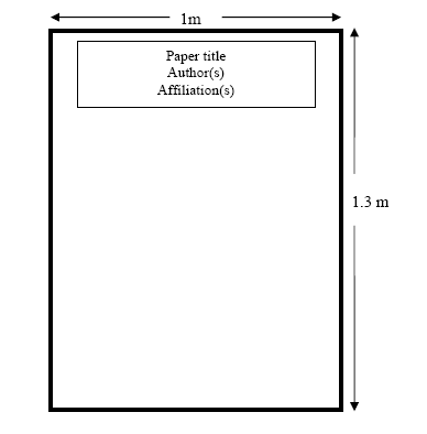
poster) to be displayed on a board, which will be 1.3m tall.
Please avoid simply using an enlarged version of your paper as poster.
The text in the visual material should not be smaller than 14 points.
Some Tips
It is ideal to have the headline of your poster containing title, and the name(s) of the author(s) at the top of the poster
(see sketch below).
Make sure that the poster can be read from a distance of about 3m.

Presentations
It is recommended that you have copies of the written version of your paper for viewers who may want to study aspects of your work
in more detail.
If possible, use color to make your poster stand out. Color makes a poster more interesting and can be used to trace the flow of
information or to help distinguish between different parts of the poster, thus clarifying your message. However, limit yourself to a
few colors that complement each other. Note that color is not a necessary requirement.


